


Should you take the time to create a business card? The answer is ABSOLUTELY! It’s an indie writer’s essential tool for the following reasons:
• To become an influencer, people need to know and recognize your name, face, and logo—a business card gives that visibility.
• Every business professional has a card; as a professional writer, you should too.
• At every writer’s event, pass out cards with every introduction—people forget words, but they remember a physical image.
• Cards are the most cost-effective publicity tool you can use.
• Cards make a statement, “I am a professional writer.”
When done well, your business card reminds people of the first time you met. Then, it encourages those interested in your book or services to contact you or visit your website for more information.
While few established writers would debate the importance of business cards, the fact remains that most authors’ cards don’t look professional. Authors are writers and not graphic designers, artists, marketing experts, so they don’t possess the skills to design a professional-looking business card. However, if an author adheres to a list of best practices when creating a business card, the product has a graphic artist’s look.
Content—Card Front
Resist the temptation to get cute or fancy with the front of your business card. Make the front matter clear, professional, and easy to understand. The content on the card’s front should include:
1. Author’s Name or Pen Name: Spell your name as it appears on the book’s title page.
2. Type of Writing or a Tag Line: The tag describes the services provided in six words or less. I used “Author and Publishing Coach.” If your focus is writing in one or more genres, the tag could reflect that, such as “Writing Historical Fiction.”
3. Writers Business or Publishers Street Address: When a traditional publishing house sells your book(s), use their address here. You may omit the street address and just list the publisher’s name.
If you self-publish your book(s), you have three options: (1) contract with a small independent publisher for some or all the publishing tasks; (2) contract with a publishing coach who can guide you through the publishing tasks and perform some as well; (3) handle the publishing tasks yourself.
The first option allows you to hand off the publishing work after you have a print-ready manuscript. These companies prepare your book for submission to Amazon, Ingram Sparks, or other indie self-publishing outlets, but the presses in-name-only usually don’t sell or distribute books. My co-author on our textbooks, Glenn Sartori, uses Prince and Pauper Press in Michigan for cover design and internal formatting for his memoirs and mysteries. His latest mystery novel includes the following statement on the copyright page, “First edition published by Enigma Books, an imprint of Prince and Pauper Press.” Pick up a copy of his latest Jennifer Sturgis Mystery, Her Father’s Past, and see how Enigma Books generated a printer-ready file from his final manuscript draft. In this case, the small press’s address appears on the business card.
In options two and three, the author performs the publishing tasks with or without the help of a coach. When a small publishing house isn’t available or willing to list the title, many indie authors establish their own publishing company through a Limited Liability Company (LLC). The LLC is a business structure that offers limited liability protection and pass-through taxation.
A future blog will describe the steps necessary to establish an LLC. Don’t miss that LLC information—enter your email into the subscription box on the Blog Page and never miss a post.
An LLC requires a physical street address; PO Boxes are not allowed. A separate address assures that book-related mail never mixes with Christmas cards and utility bills at the home address. In addition, the author in an LLC can open a different bank account to keep book transactions separated from personal financial activity.
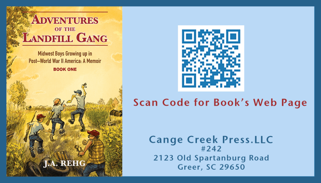
I established Cange Creek Press LLC for all of my writing activities and Cottonwood Books as an imprint for publishing the Landfill Gang Adventure Series. My LLC’s street address lives at the mail center of a local UPS store.
4. Writer’s Business Email Address: Most web-hosting sites offer free email addresses as a part of the hosting services. So to keep writing emails separate from personal electronic mail, create a writer’s email address. I created two writer’s emails to keep book communication separate from my personal email. My Contact Page on the website uses the email JARehg@mywritersnook.com to channel mail to me. MailerLite, my mail marketing application, uses a different mail address to collect the emails of website subscribers.
5. Your Website URL: The best platform builder is an author website. Put it on your business card.
6. Author’s Photo: A picture isn’t necessary, but a photo makes the card more dynamic and memorable with one added. I think a picture is essential, but keep it in proportion with the rest of the card, make it a headshot, get a professional photoshoot from a studio, and place it to the left side of your contact information.
7. Logo or Trademark: If your goal is to become an influencer in some aspect of writing and publishing, then the logo is your visual representation as an author, an image for readers to remember. Place the logo at the top of the card. Logos fall into three categories:
- Written name: The simplest form, called a wordmark, lets your name represent your brand. Google and Visa are examples of wordmarks for iconic brands. It’s a good practice to buy the URL web address for the name and link it to the author’s website. I own my wordmark URL, JARehg.com. It is important to spell your name or wordmark the same across published works and marketing materials. How you spell your name makes a difference as well. The following image for my wordmark logo is below.
I shortened James A Rehg to J.A. Rehg for my author’s name and logo because my son, James M. Rehg, is a Georgia Tech professor and prolific publisher of research material. So, he dominates Google searches with James and Jim used for the first name. For example, when I searched with James as the first name, 70 of the first 100 Google search listing were my son’s published material. I have less than 10 for my books. However, J.A. Rehg in the search field boosted my listing up to 40 with four links to my books into Google’s top ten list. Do some searches with possible name combinations to see where you stand with the crowded internet. - Monogram or letter mark: These trademarks use letters to represent a business or individual. Abbreviations work well for a long name, like International Business Machines (IBM). This logo type is not appropriate for authors.
- Symbol: The last type uses a graphic image to represent the business entity or writer. A shape, abstract or actual life, represents your brand. It may stand alone or accompany the brand’s wordmark. The name Apple and its iconic apple silhouette is an example of this type of combined logo. A symbol type could work well with an author’s wordmark. Use a high-quality image at a minimum of 300dpi (dots per inch), so edges appear crisp in print. The logo should be scalable for different materials—business cards to posters—and display in color plus black and white renderings.
8. Writers Phone Number (Optional): If you have a business phone number, add it here. Don’t list your personal cell or home phone number.
9. Your Social Media Profile URLs (Optional): Add these if you have the space on the card front.

Content—Card Back
The back has no rigid standards for content. Here you can get creative and generally explore the things that make your writing stand out above the crowd. Content must still be straightforward and concise, but fancy or even weird is allowed. Possible uses for the back include:
- Your current list of books in print.
- The URL link to your newsletter’s subscription page.
- A brief excerpt from your book
- Your book cover
- Book reviews from other authors
- Your author bio
- A short book blurb, refer to my blog post 5 Steps To Write Memoir Blurbs That Hook Buyers.
- An offer to download a copy of your book or other free giveaway
- Add a QR code. Refer to my blog Boost Book Sales With QR Codes. The post explains QR codes and how to generate them. The public’s comfort level with scanning QR codes has shot up; adding one to your business card creates a fantastic one-click way to send people to your website, get them into your mailing list, or give them a special promotion. The QR VCARD option puts business card information into a formatted output ready for the scanner’s contact list. Put the code on the back of your business card for easy scanning.
If you place text and images on the back, make certain neither crowd one another out. White space is golden, and the less-is-more rule applies.
The Card’s Physical Characteristics
The size, shape, paper type, color, font, character placement, and white space equally produce a card that makes the bearer look professional. After the text on the card, how the words look comes in a close second. The following sections address each characteristic in order:
Card Size and Shape: Most business cards are rectangular with the following dimensions:
- Card size in inches: 3.5″ x 2″
- Card size in cm/mm: 85 x 55 mm
- Card size in Photoshop: 1050 x 600 pixels
The commercial printer you use will have samples of standard cards with dimension specifications. Two printing sources I’ve used are Vista Print and Best Value Copy. The cost for 100 standard size, color printed front and back, medium weight cards are between $20 and $30; who does it is your call.
Other shape options include rounded corners, squares (2.5 inches x 2.5 inches), and a unique shape. The standard finish is matte and glossy, but special finishes are available. Check out the Vista Print site for texture options. But keep in mind, the further away you move from the standard card, the higher the cost.
Also, check out Canva, the best graphic template application on the web. On the home page, slide the bar labeled You Might Want to Try, one group to the left, and click on Business Cards. You see sample cards down the left side and your blank design card outline on the right. The left-side menu bar has all the design tools. Check them out to see how easy Canva makes card design. Their QR code generator makes producing a code linked to any website a one-step process. That’s a great feature this site offers. At the top of the sample cards, type Author into the Theme search box. Four sample Author cards appear. You can start from any of Canva’s samples to build your card or start from scratch. The Vista Print Templates and Design center is also worth a look—check it out.
Paper Type and Weight or Thickness: Business card thickness is measured in “points,” abbreviated as “pt,” or in categories like Economy, Standard, and Premium. Higher points numbers indicate thicker card paper. Standard business card thickness is 14pt, but weights can vary by paper type. For example, Vista Print’s ultra-thick business cards are 32pt, and the Premium Plus cards are 18pt. Thickness is not a big deal, pick the standard weight, and you’re good.
Fonts—Type, Style, and Size
The font used must be clear and easy to read in a small font size. Beyond that, you are looking at several types: serif versus sans serif and monospace versus script. Serif types have small additions to the letters, usually at the top and the bottom, that make them fancier and reminiscent of calligraphy and high-quality print. Times New Roman is an example of a serif font. Fonts with serifs evoke history, artistry, creativity, and class. Garamond and Georgia are other popular serif fonts. They’re great for fantasy and mystery writers, history, and nonfiction books about literary, artistic, and historical topics. If those are your genres, a serif font may be your choice for the card.
Sans-serif fonts lack curly embellishments and tend to feel clean, modern, even futuristic. Arial, Calibri, and Tahoma are examples. Sans-serifs are usually the best contemporary fonts for business cards since they convey simplicity and minimalism. The Canva site’s business card examples use only san-serifs—a good indication you should as well. They’re a good choice for science fiction, modern memoirs, and nonfiction books dealing with present-day topics. If those are your genres, you may want to use a san-serif font on the card. I used Stone Sans Sem ITC TT on my card—Stone is a clean, crisp font without the bold stiffness of Arial.
Monospace and script fonts offer a different look. Monospace makes each letter occupy the same width on a line of type and can include both serif and san-serif font types. Courier, Lucida Console, Menlo, and Monaco are examples. The evenly spaced fonts look more professional and buttoned-down. Script fonts mimic handwriting, with some letters taking up more or less width on a line. These fonts appear more playful and creative—a good change of pace on the card. When used on a business card, script fonts fall into the second-tier of text in a tagline or motto. I used Brush Script MT for my tagline Helping Indie Writer Self-Publish.
You decide but base your decision on what you write about and the image you wish to project as a writer with one caveat. It is much easier to make bad mistakes with serif and script fonts than with monospace. If you’re not great at design—better select a monospace sans-serif font. You’ll never alienate the reader with this easy-to-read choice.
Industry measures font size in points (pt). Prominent text elements, like your name and publisher’s name, should be between 10pt–16pt, adjusted for the space you have available. The size of your secondary text (job title, email address, etc.) should look noticeably smaller than the primary text but still legible and easy to read. The minimum font size used should be 8pt. Note, specific fonts appear smaller than others even at the same point size. Also, be careful with script and serif fonts at low point sizes because readability decreases as point size drops. For the small print, use a sans-serif font. Some general rules for fonts:
- Limit your card design to two fonts.
- Pair a script or serif font with a sans-serif.
- Avoid pairing fonts that look similar.
- Use different text display options (bold, regular, italic) of the same font to create contrast.
- Create contrast between the text and card background to make text fields to stand out.
Final Considerations
Remember that business card dimensions may include a “bleed area,” which is extra space for images, patterns, or design elements that extend beyond the cut edges—this prevents white borders around your finished card.
I’m always interested in my reader’s projects. What are you working on? Let me know here. Leave a comment and sign up for a short monthly newsletter so you never miss an informative post.


3 thoughts on “Simple Steps to Create the Perfect Author’s Business Card”
Great job Jim. Lots to think about.
I’m currently working on my memoir, a novel, and short non-fiction articles on Life in the Time of Covid. Takes a lot of time.
Keep me on your email list. Martha Hardee
Thanks Martha for the comment. Memoir is rewarding keep at it. Your on the mailing list.
Jim
Thanks. Will do.